


This post has been reposted from the CompassRed blog
When I first learned about the team here at CompassRed, the article below from Data Analytics Team Lead Patrick Strickler stood out. Creating a custom click heatmap using Google Analytics, Google Tag Manager, and Google Data Studio was (and still is) an innovative approach to extending Google Analytics capabilities.
How to Create a Click Heat Map for Your Website using Google Analytics Event Tracking and Google…
*Have you ever seen one of those fancy heat maps that tools like Hotjar and CrazyEgg can produce, but were hesitant to…*medium.com
In order to get the data required for the view shown in this article, you will need to follow the instructions outlined in Pat’s original post. There, you’ll find the JavaScript for Google Tag Manager to capture x/y coordinates of a click in a Google Analytics event. If you’re just here for a cool viz, keep reading!
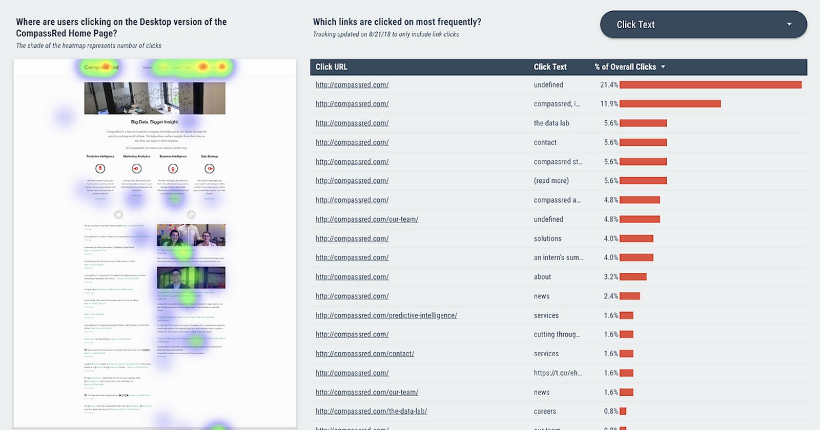
The Old vs. New Heatmap Visualization in Data Studio

The original visualization resulting from the custom implementation work is awesome. A report viewer can get an understanding of which areas on the page are generating the most engagement.
Unfortunately, when you scale this up, the size of the bubbles gets lost and it’s hard to differentiate exactly which part of a small area is getting the most engagement. Radius size starts to lose its value at scale.
With the arrival of custom visualizations using JavaScript, HTML, and CSS in Google Data Studio’s Community Visualizations, I wondered if this report could be brought to the next level. Using the simpleheat library from Leaflet creator Vladimir Agafonkin, here’s the result:

Now, report viewers are able to get a better sense of engagement using a familiar heatmap visualization. Tightly packed data points are rolled up into a nice red shade making it easier to derive insight.
Note: we’re adding a Device Type filter for desktop and a relevant screenshot of the page underneath the visualization itself (per the original post). It’s not possible to make external requests in Data Studio Community Visualizations so uploading an image into the Data Studio report itself is required.

Configuration
The dimensions and metrics required are straight forward. If you‘ve followed the tutorial in the original post, then you’ll have X Val and Y Val calculated dimensions to use and native Total Events for the metric.

Radius Size (px) will adjust…radius for each data point.
Blur Size (px) helps the gradient become more/less precise. Higher blur results in a smoother gradient.
Minimum Opacity (0 to 1) will help decrease the visibility of lower value data points.
Color Selection will adjust the color gradient. User input can control the colors for the following stop values: Low (25%), Mid (55%), High (85%) and Max (100%).
Try it Out!
If you’ve implemented the heatmap eventing described in the original post and want to try out this custom visualization, you can use the following Google Cloud Storage bucket link when adding a new community visualization via manifest path.
gs://ds-viz-cr/public/heatmap
We’re excited to share this custom visualization with the community. Please share your thoughts and questions, either here on Medium or Twitter! Happy Heatmapping!