


This post has been reposted from the CompassRed blog
If you’re familiar with Google’s dashboarding tool Data Studio, you know the types of visualizations and styling that come with it. The feature set within Data Studio is continuing to grow and now the Data Studio development team is putting this feature set in the hands of its user community with Community Visualizations! Community Visualizations can make use of custom JavaScript and CSS to take Data Studio reports to the next level.
Having played around with JavaScript data visualization libraries and front-end web development in the past, I wanted to find some examples to implement into a proof-of-concept report. The Data Studio report below (linked here) makes use of JavaScript charting engine Highcharts JS as well as JavaScript/CSS for animated text. The possibilities are endless with this new Data Studio feature; I’m excited to continue exploring! Below are some of my learnings as I’ve gotten familiar over the past month.
On not being a JavaScript developer
Going from drag-and-drop dashboarding tools like Data Studio, Power BI, and Tableau to JavaScript-based visualizations can seem daunting. Luckily, the Data Studio team is working hard on providing “Getting Started” documentation and even a Codelab!
After completing the Codelab, looking at others’ examples, and getting setup with the Data Studio Developer tooling, a concept I had to wrap my head around was how to compile the JS I was writing (and libraries I was using) into one bundled file. This is a different workflow from calling externally hosted JS in the<head> tag of an html file or calling a package using library() in R. The answer is webpack and it is integrated into the tooling!
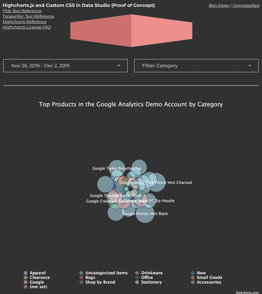
Using an external JavaScript charting library like Highcharts JS
Highcharts JS has a very cool (and animated) packed bubble chart that I used in the above example. Here are some tips for using an external JS library:
Pay attention to data format. You might need to use the
.map()or.reduce()methods to reshape the data into the desired format. In this case I used.reduce()to iterate through the data returned by Data Studio and create a new array grouped on the Product Category dimension.Turn off any functionality that might make an external call. Since Data Studio Community Visualizations don’t allow external requests and Highcharts makes a call to its servers when downloading an image of the visualization, I toggled this off by adding
exporting: {enabled: false}.Make sure you adhere to the library’s license. All Data Studio Community Visualizations are public, and if you decide to share your code (or plan on submitting to the Data Studio gallery) you’ll need to make sure you understand the licenses of all of the libraries you’re using.
Using non-data-driven elements for report styling
One realization I had while learning was that the world of JavaScript and CSS provides so much opportunity for flashy styling! Why not build a component that requires no dimensions/metrics and uses CSS to animate text based on user input? In theory the style pane could control colors, animation settings, or pretty much any other attribute of your component!
Some other helpful tips
Set the background color of your custom component to the same color as your report background to avoid discolored boxes while the report loads.
Set
devModetotruein your manifest.json file to disable caching when loading your visualization many times in a hosted Data Studio report.Unfortunately, Data Studio reports making use of Community Visualizations cannot be embedded in a webpage via iframe. I created a gif in this post using GIPHY Capture.
The Google Analytics Demo Account is a great data source for building Custom Visualizations! Since there is no API access to the account, this allows a new level of freedom with this “playground” data.